Mobile Application
Project Overview
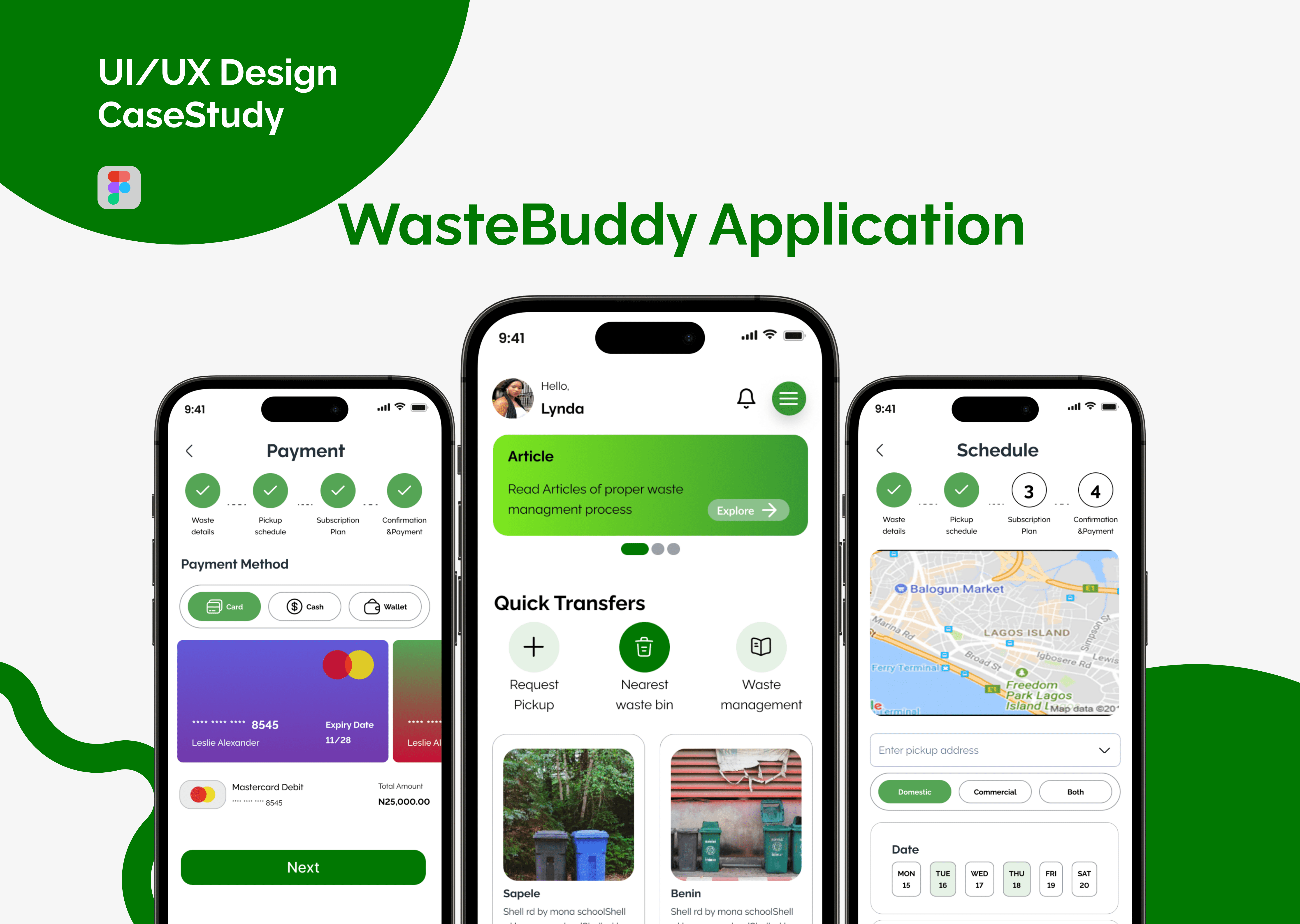
The WasteBuddy project aims to revolutionize waste disposal in Nigeria by providing a user-friendly mobile application. This platform facilitates scheduled waste pickups, promotes eco-friendly practices, and aligns with cultural values. WasteBuddy transforms waste management into a convenient, transparent, and sustainable experience for households and businesses.
My Role
UX Designer
My Responsibility
UI/UX Designer, User Research, Wireframes, Interactive Prototype
Project Brief
Develop a system that streamlines waste disposal processes, ensuring timely and efficient pickups for users.
Encourage eco-friendly habits by providing information, resources, and features that support responsible waste management.
Allow users to customize and schedule waste pickups according to their preferences and lifestyles, promoting convenience.
Implement transparent pricing models to eliminate the need for negotiations, providing clarity and fairness to users.
Design an intuitive and user-friendly mobile application interface to ensure a positive and seamless user experience.
Research Methodology
I was able to achieve the goal of the project by using the 5 design thinking methodology

Understanding the Users
Research

Survey
For our WasteBuddy project, my goal in conducting user surveys is to connect directly with our end users, understand their unique needs, and gain firsthand insights to inform the design of our waste disposal app. I want to create an interface that not only meets but exceeds their expectations.
Process
Participant Selection
Personally sent a survey to a diverse group of participants, ensuring they represented the actual users we aim to serve.
Included individuals with varying levels of familiarity with waste disposal issues
Questionnaire Development
We crafted a tailored set of open-ended questions reflecting our project's goals.
Designed questions that delve deep into participants' experiences, aiming to uncover their stories and preferences.
Analysis the survey
Created an affinity diagram to analyze the survey responses
Came up with themes and insights
Pain points
Users face challenges with irregular waste pickup services, leading to frustration and environmental concerns.
users face challenges in bargaining disposal costs, affecting their overall satisfaction with the waste disposal service.
Users highlight the time delays in waste pickup services, especially during holidays, contributing to a dirty environment.
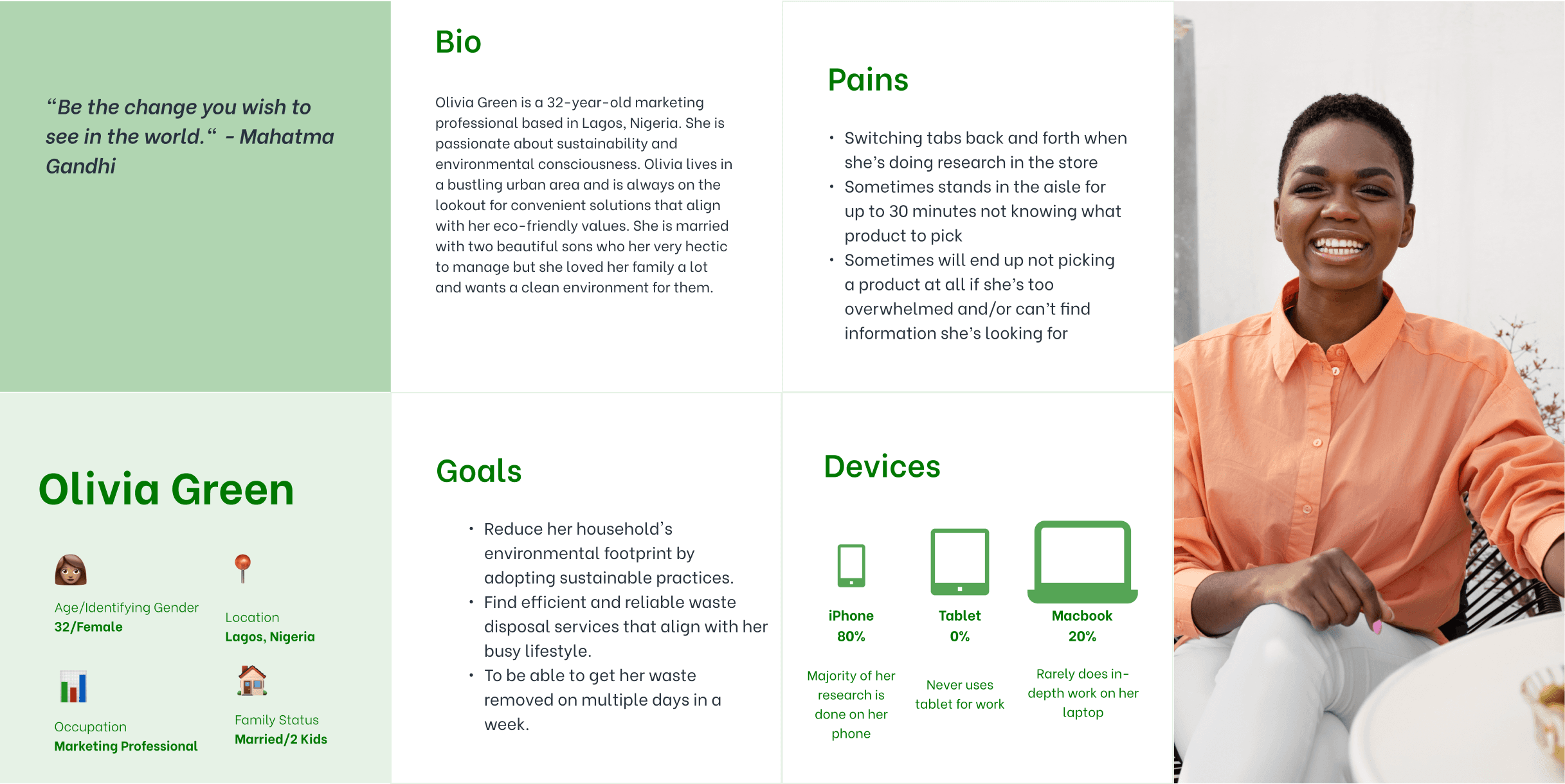
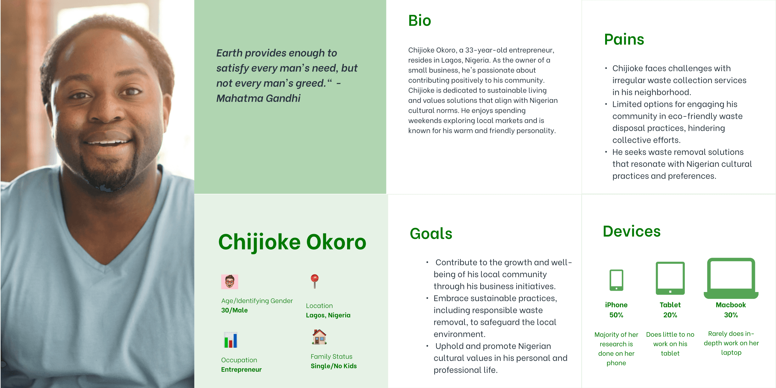
User persona
The response I got from the survey I did led to these user personas
Competitive Analysis
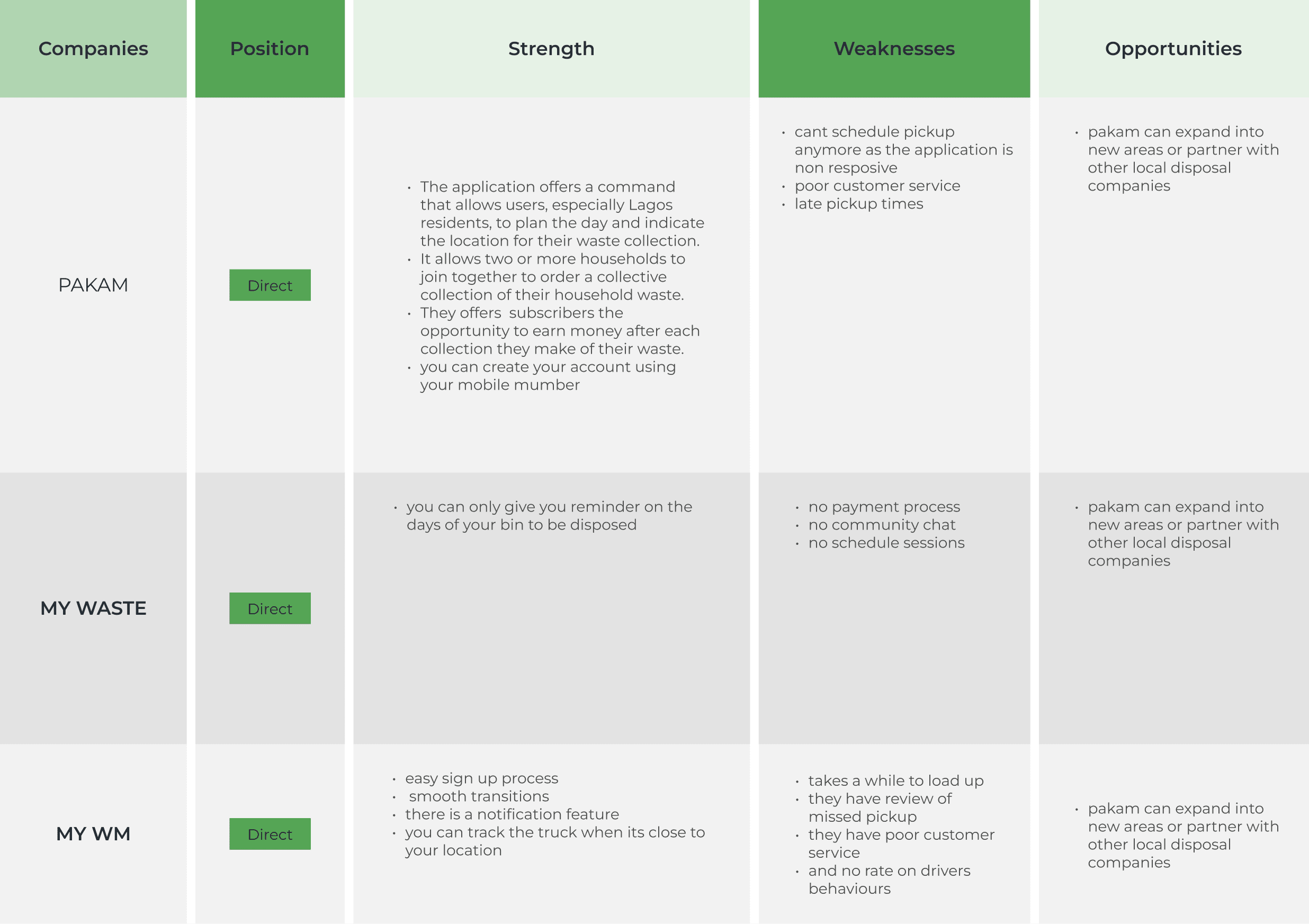
Based on the surveys and the user interviews conducted, I took time to analyze the most popular waste disposal application in the market to better give WasteBuddy a competitive edge and to find a unique selling feature for WasteBuddy.
Empathy Map
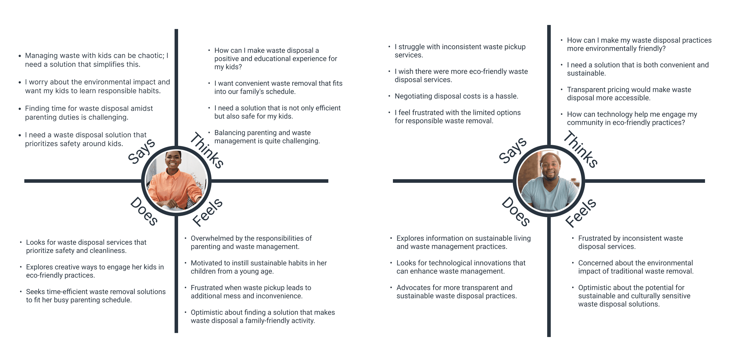
The response I got from the survey I did led to these Empathy Maps
User Flow
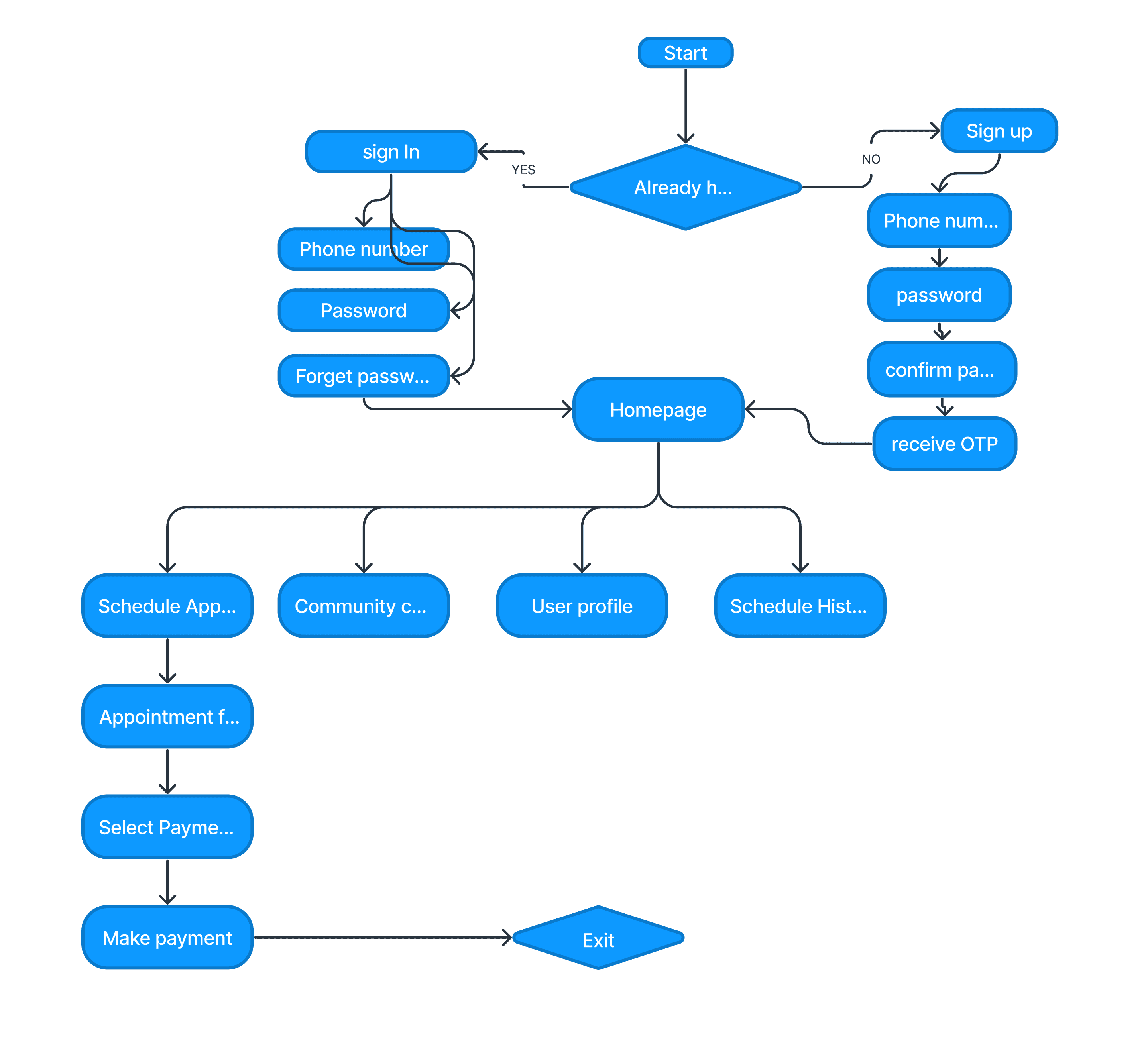
This user flow provides a high-level overview of the key interactions users have within WasteBuddy, emphasizing more on simplicity, security, and efficiency in managing various Schedules pickups, and account-related activities.
ITERATION AND PROTOTYPING
Solutions
The application can provide a scheduling feature that allows users to set regular waste pickup days, ensuring consistency and reliability in waste removal services.
Implement transparent pricing models within the application, allowing users to view and choose subscription plans based on their budget, eliminating the need for negotiation.
The application can offer a feature for users to schedule waste pickups at specific times, ensuring efficient and timely services tailored to the users' preferences and daily routines.
Wireframes
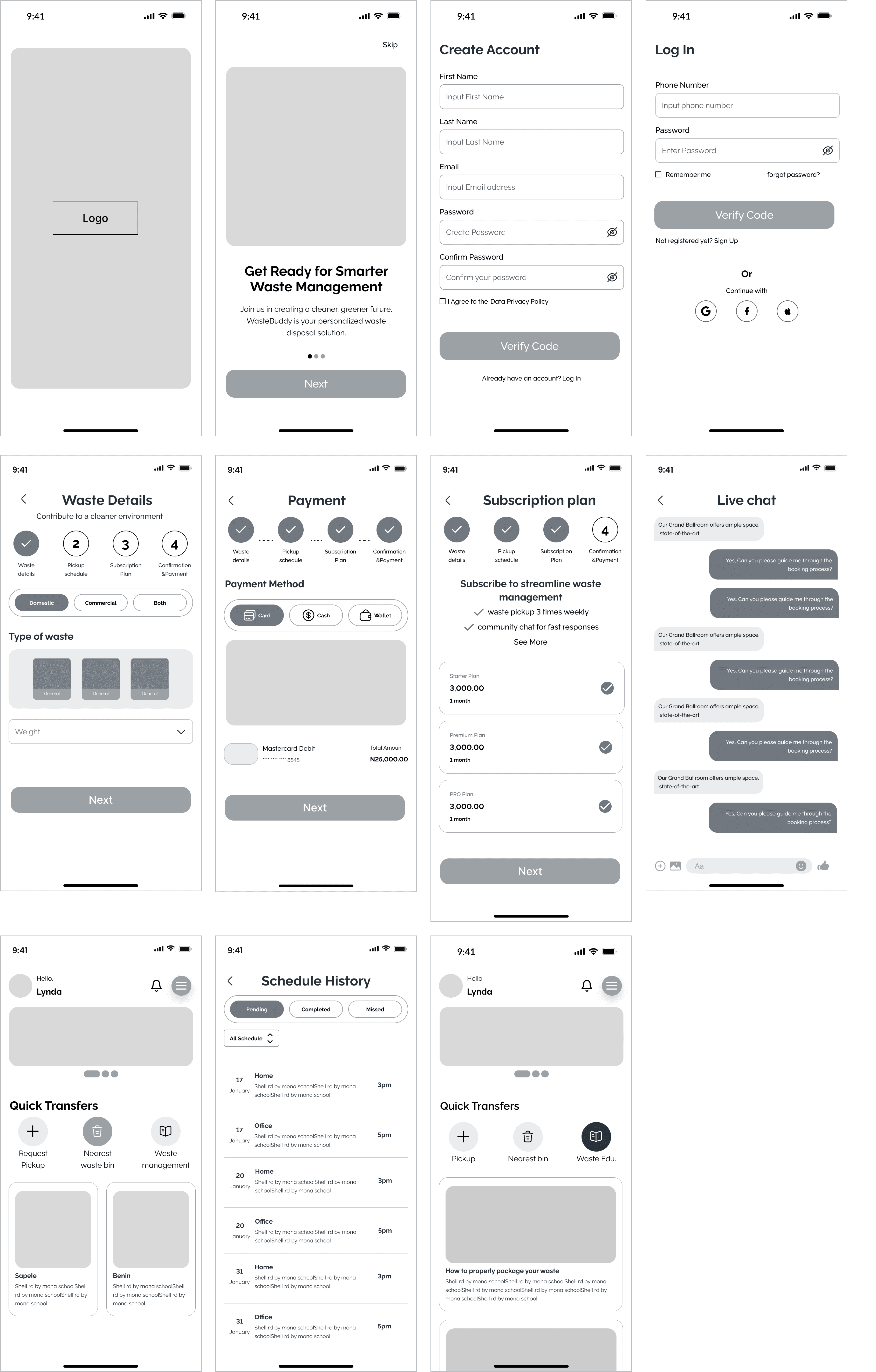
After defining the WasteBuddy structure, I started by outlining the key features and functionalities I envision for WasteBuddy, considering user needs and pain points I identified during our research process.
I also sketched a basic layout structure, to determine the placement of essential elements like navigation bars, buttons, and account details. I also created a simplified wireframe, outlining the main screens of the app. This included the home screen, schedule page, payment page, settings, etc.
Drew arrows to indicate the flow of the app navigation between different screens. I ensured a logical and user-friendly progression through the app.
Positioned key elements such as buttons, icons, and information fields within each screen. I considered the hierarchy of information and the visual balance of the interface.
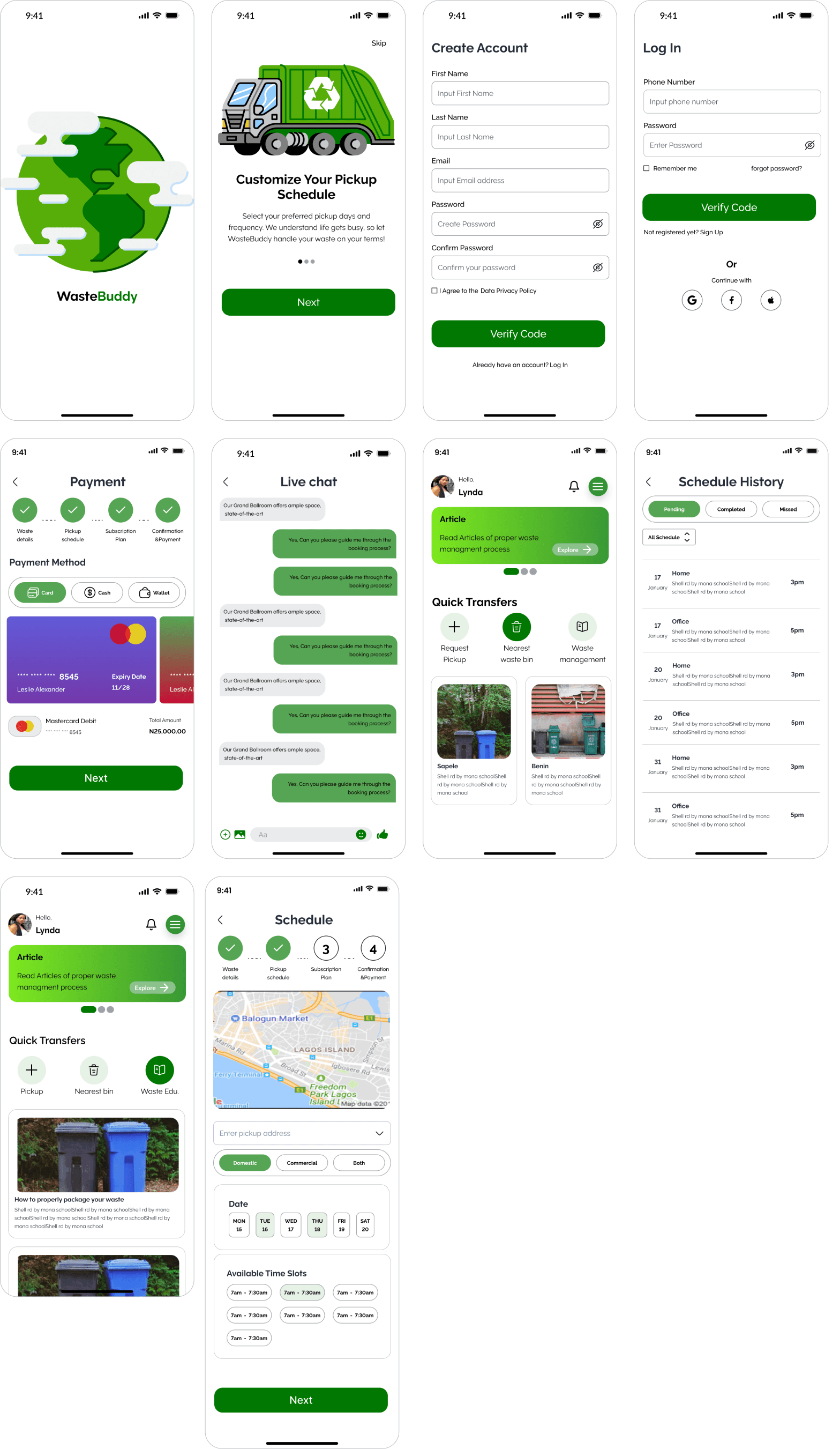
High Fidelity Prototypes
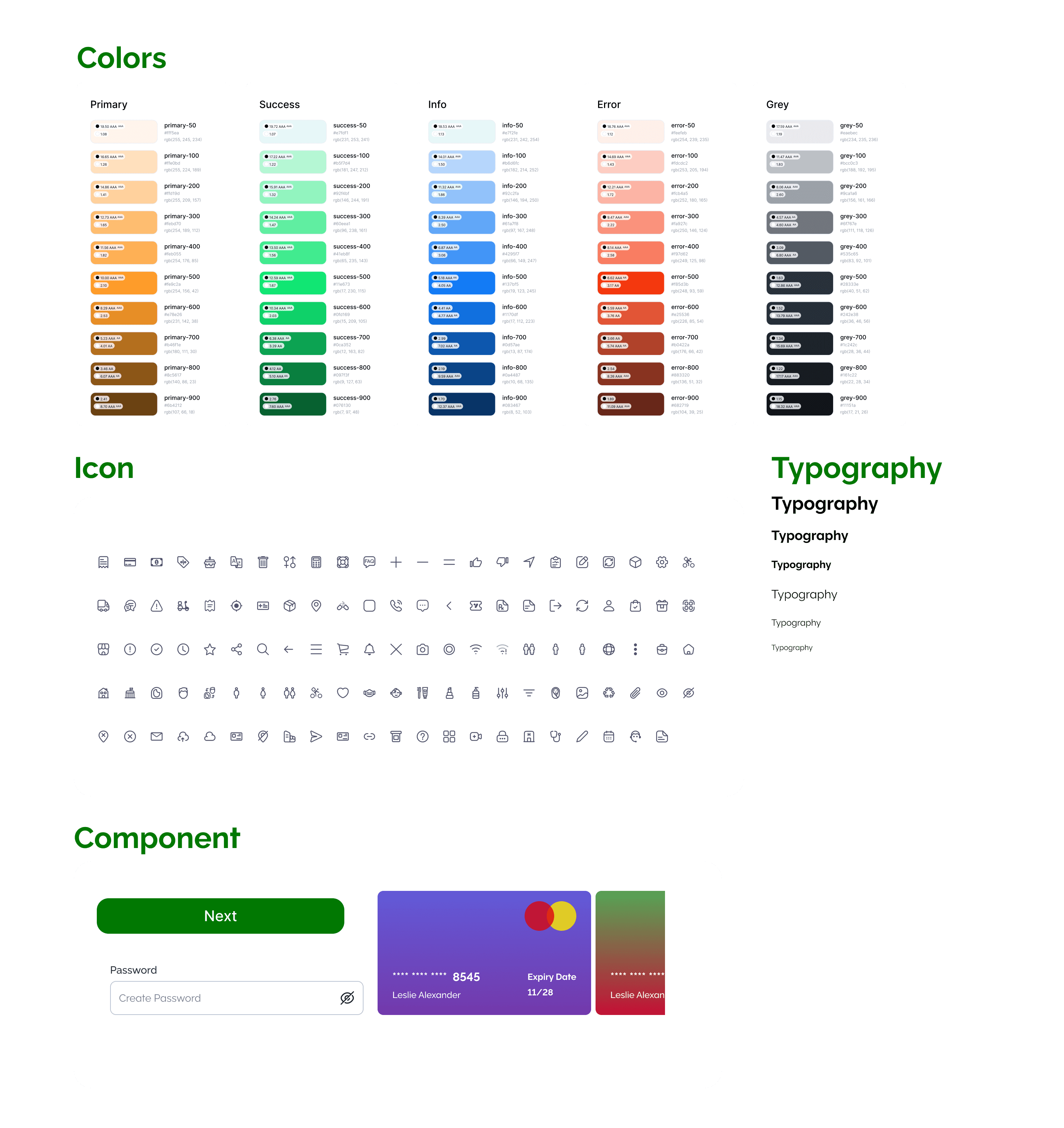
Style Guide
Prototype
here is a link to the prototype:
