Mobile Application
About Project
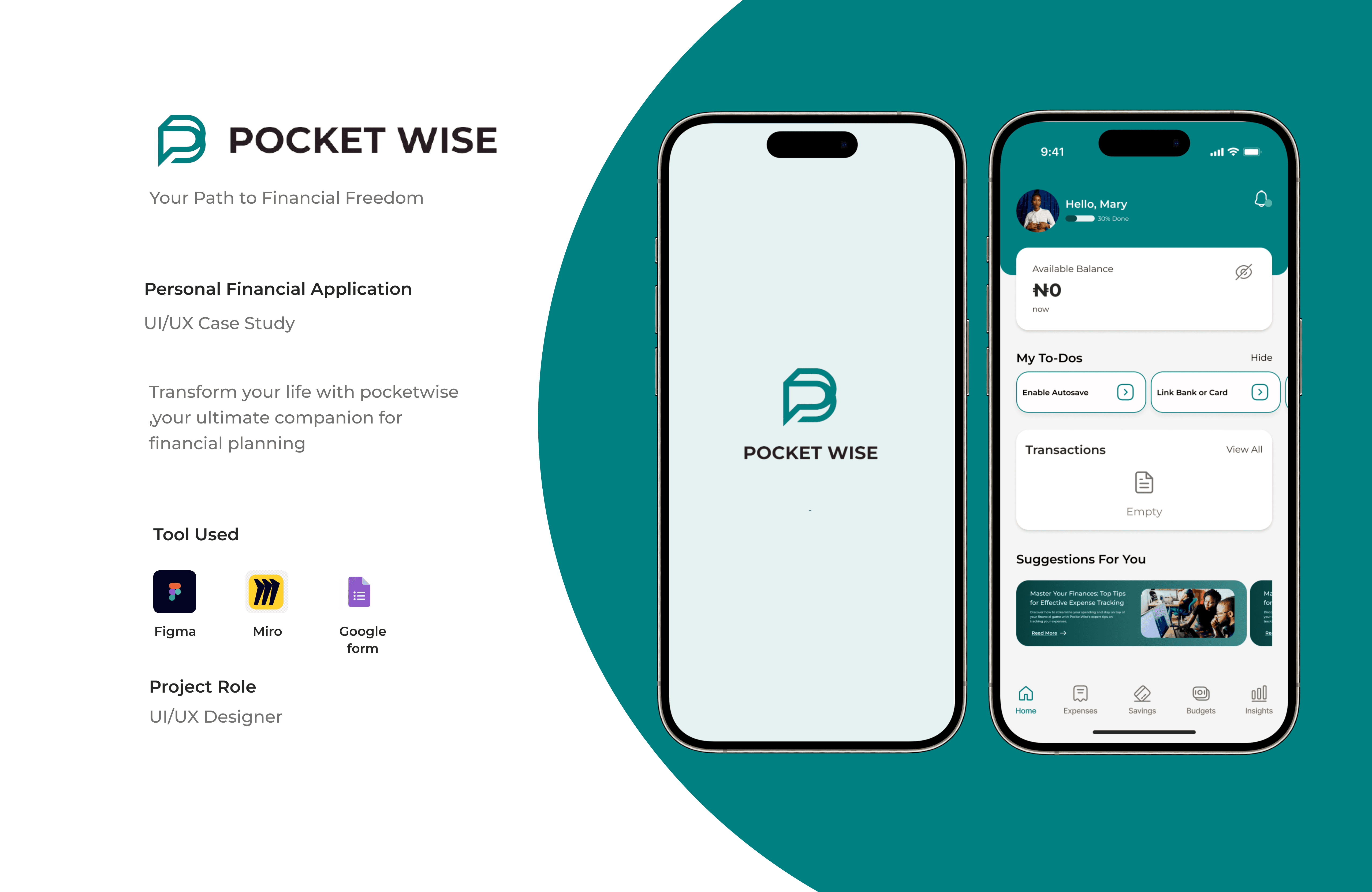
PocketWise is a mobile application designed to empower users to manage their personal finances effectively. The app provides intuitive tools for tracking expenses, creating budgets, setting savings goals, and gaining financial insights. Targeted at young professionals, families, and students, PocketWise aims to simplify financial management, helping users achieve their financial goals through a user-friendly and visually appealing interface.
My Role
UX Designer
My Responsibility
UI/UX Designer, User Research, Wireframes, Interactive Prototype
Meet the Team

User PainPoint
Complex Setup Process
Users may find the initial account creation and bank integration steps too complicated or time-consuming.Manual Expense Entry
Users could be frustrated with having to manually log expenses if automatic bank tracking is unavailable or unreliable.Budgeting Confusion
Users may struggle with understanding how to effectively create and manage budgets within the app.Security Concerns
Users might worry about the security and privacy of their financial data, leading to hesitation in linking sensitive information.
Research Methodology
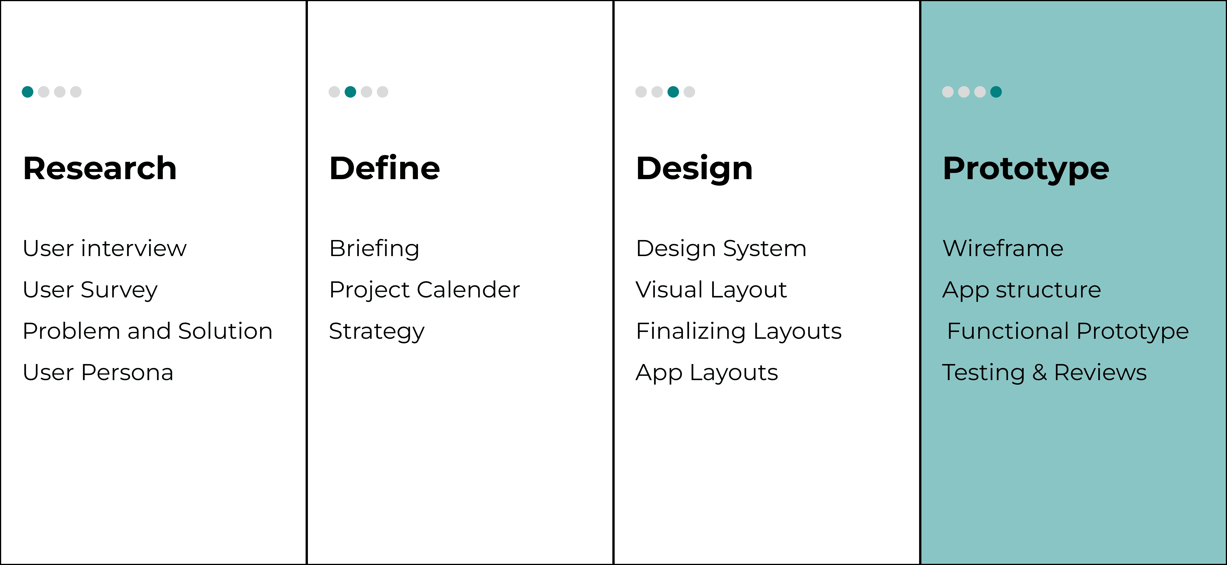
I worked with a strategy for user experience and also carried out research for functional and aesthetic user interfaces carefully for optimum results.
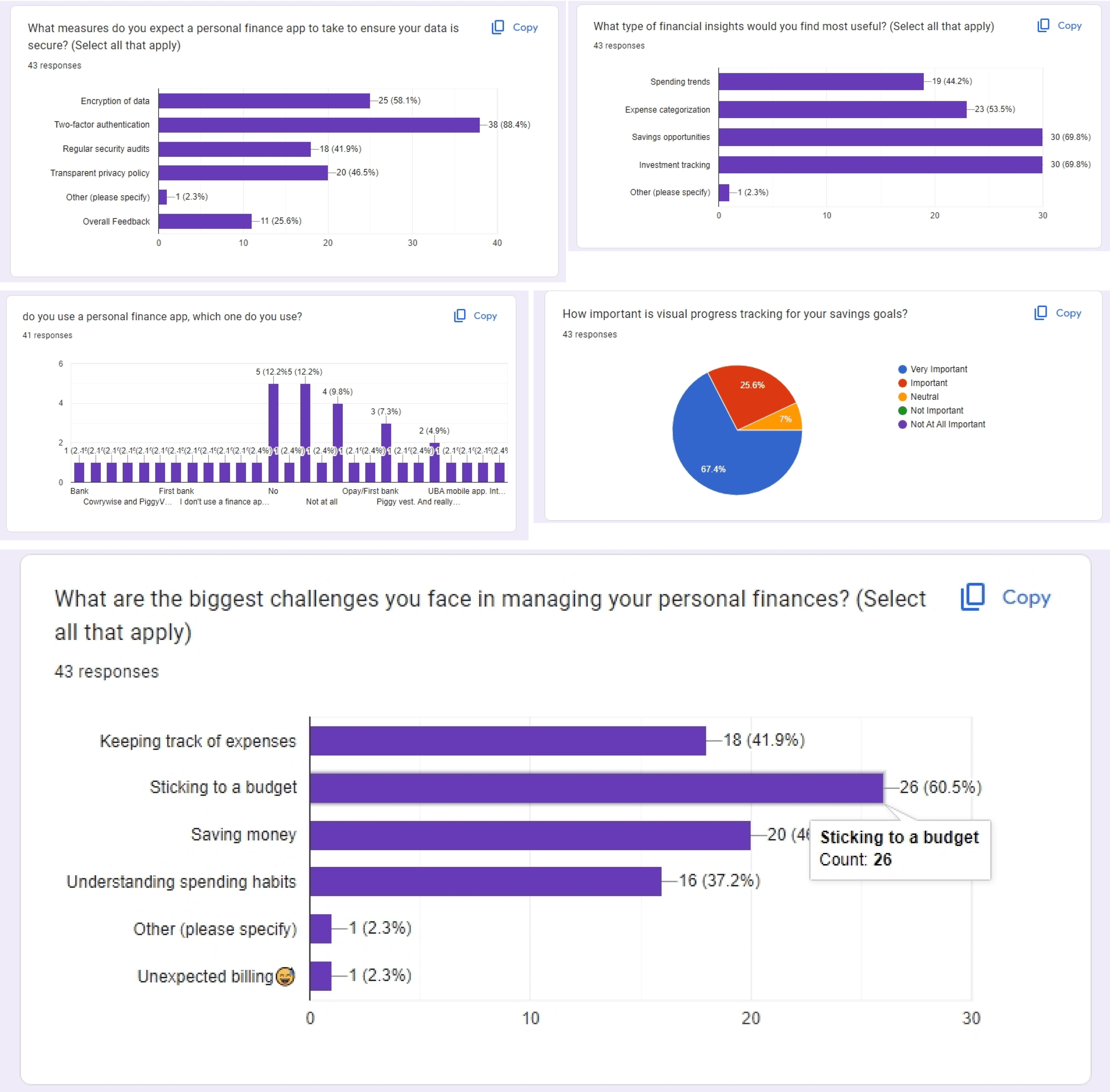
Survey
Qualitative questions were used in our survey approach to extract results that helped in understanding the gaps in the market and potential opportunities for improvement and innovation.
User Persona
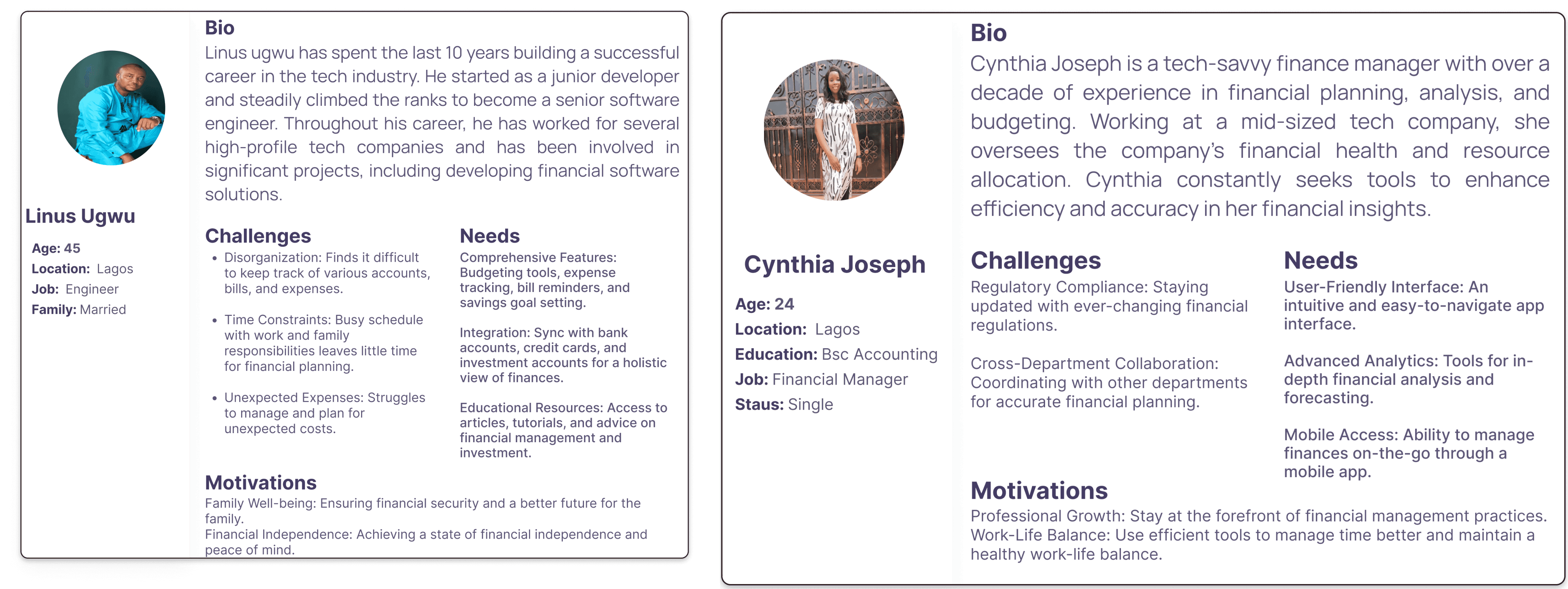
The user persona helps us acquire a deeper understanding of the user's pain points and frustrations, behaviors, and expectations for better project delivery.
Empathy Map
User Journey Map
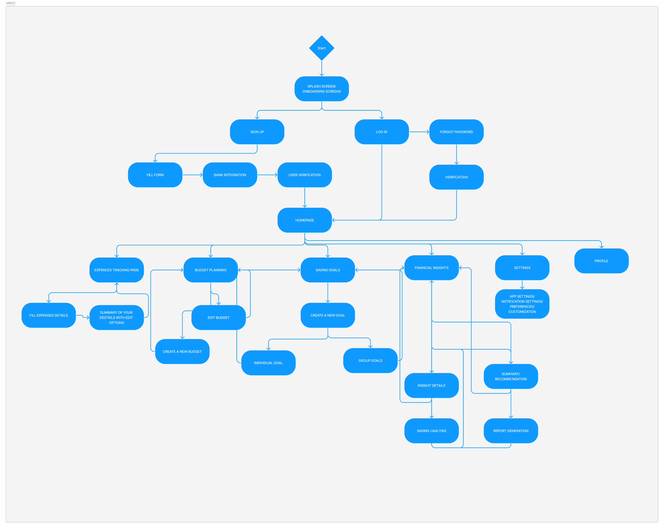
User Flow
User flow was employed to define the interface that would be designed for a user-friendly interface. A pleasant and well-ordered user flow was designed to improve user experience.
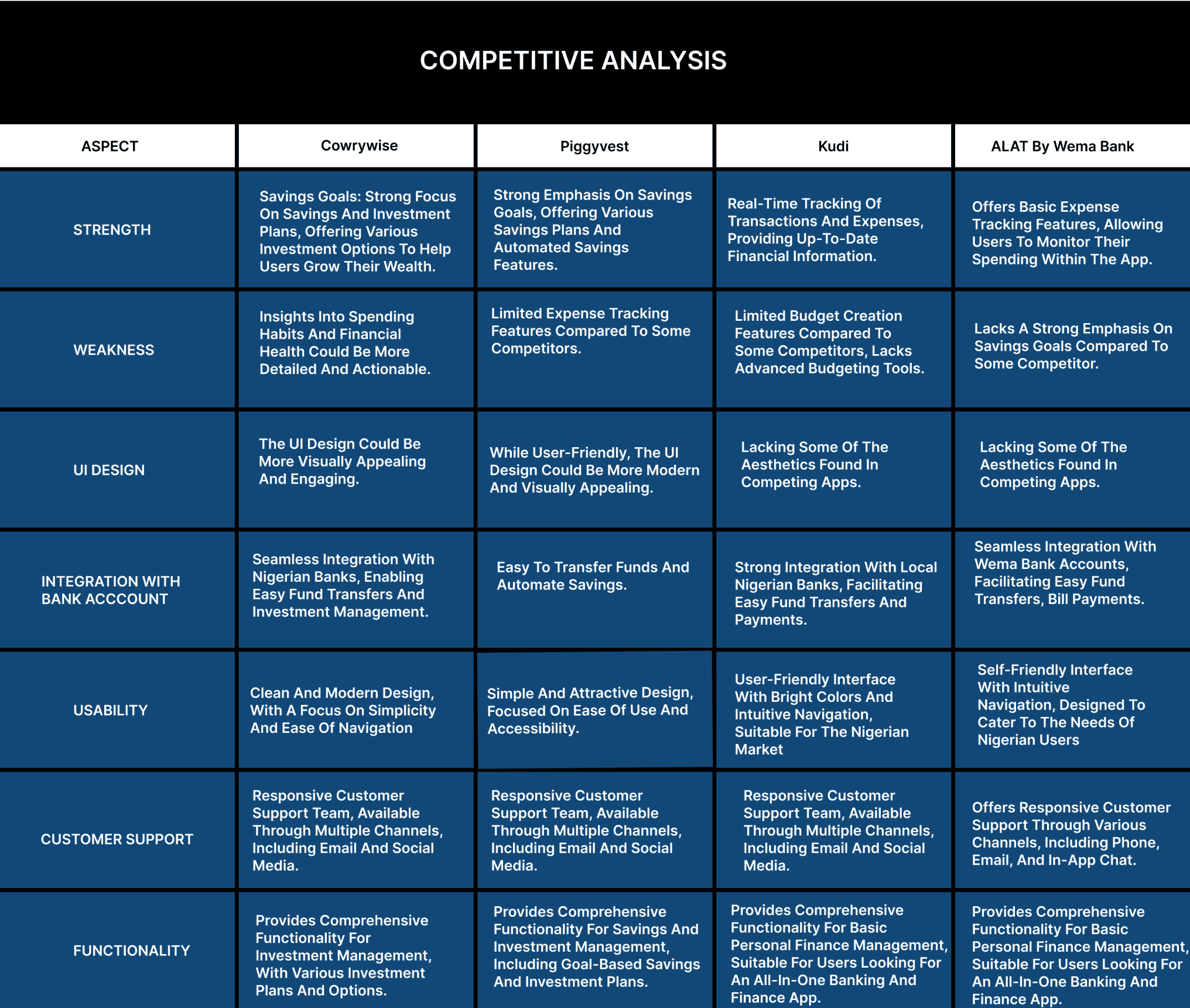
Competitor Analysis
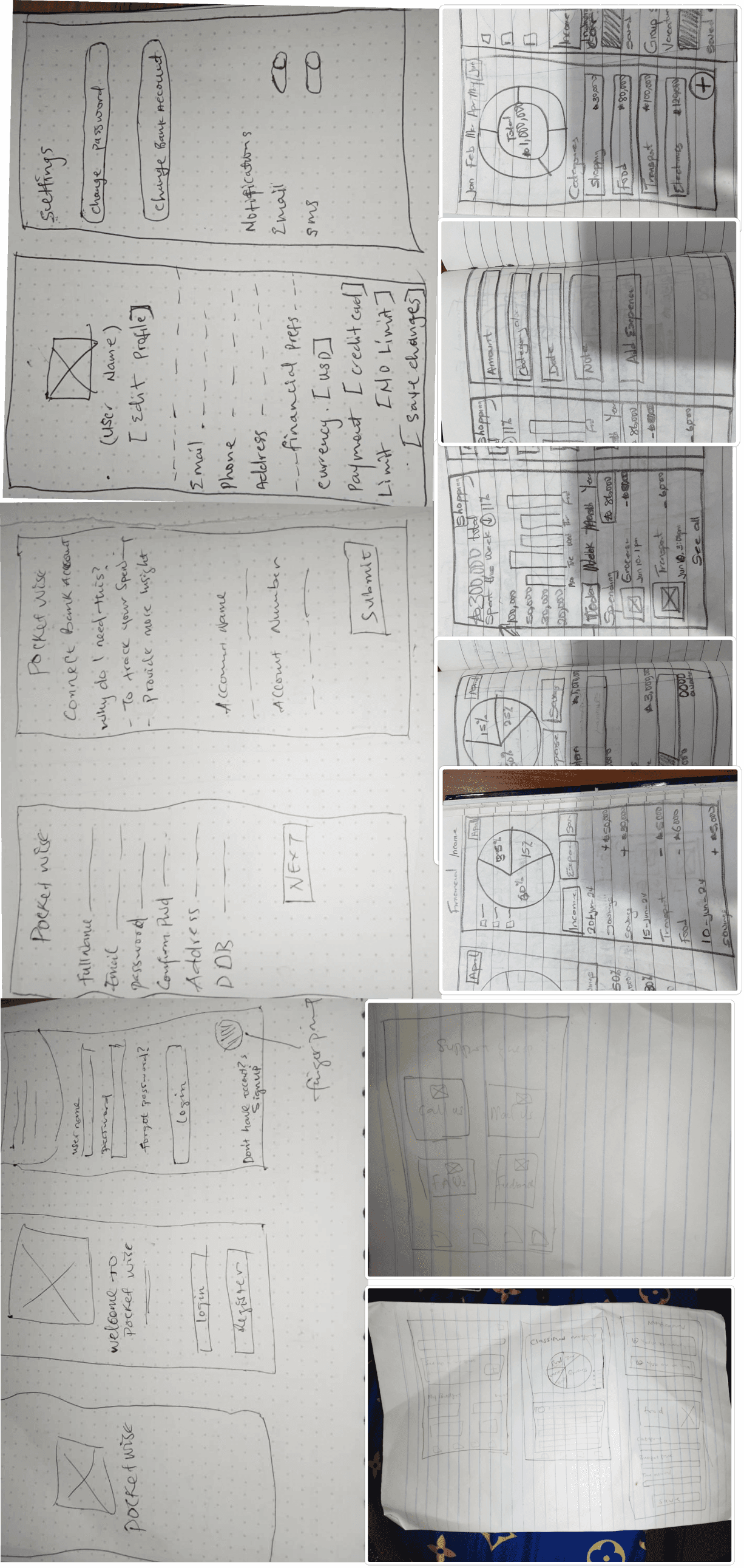
Paper Wireframe
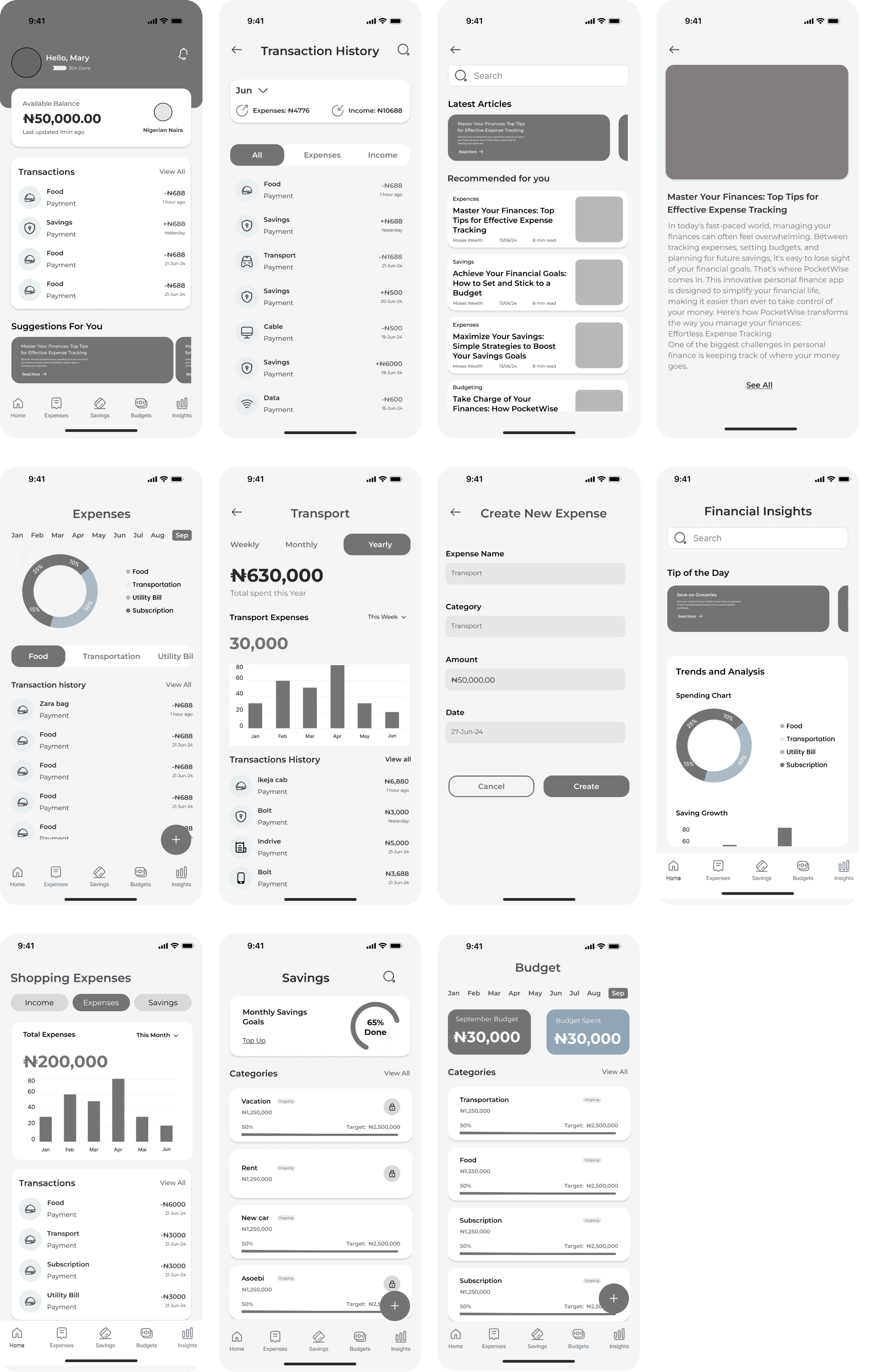
LOWFI WIREFRAME
USABILITY STUDY PLAN
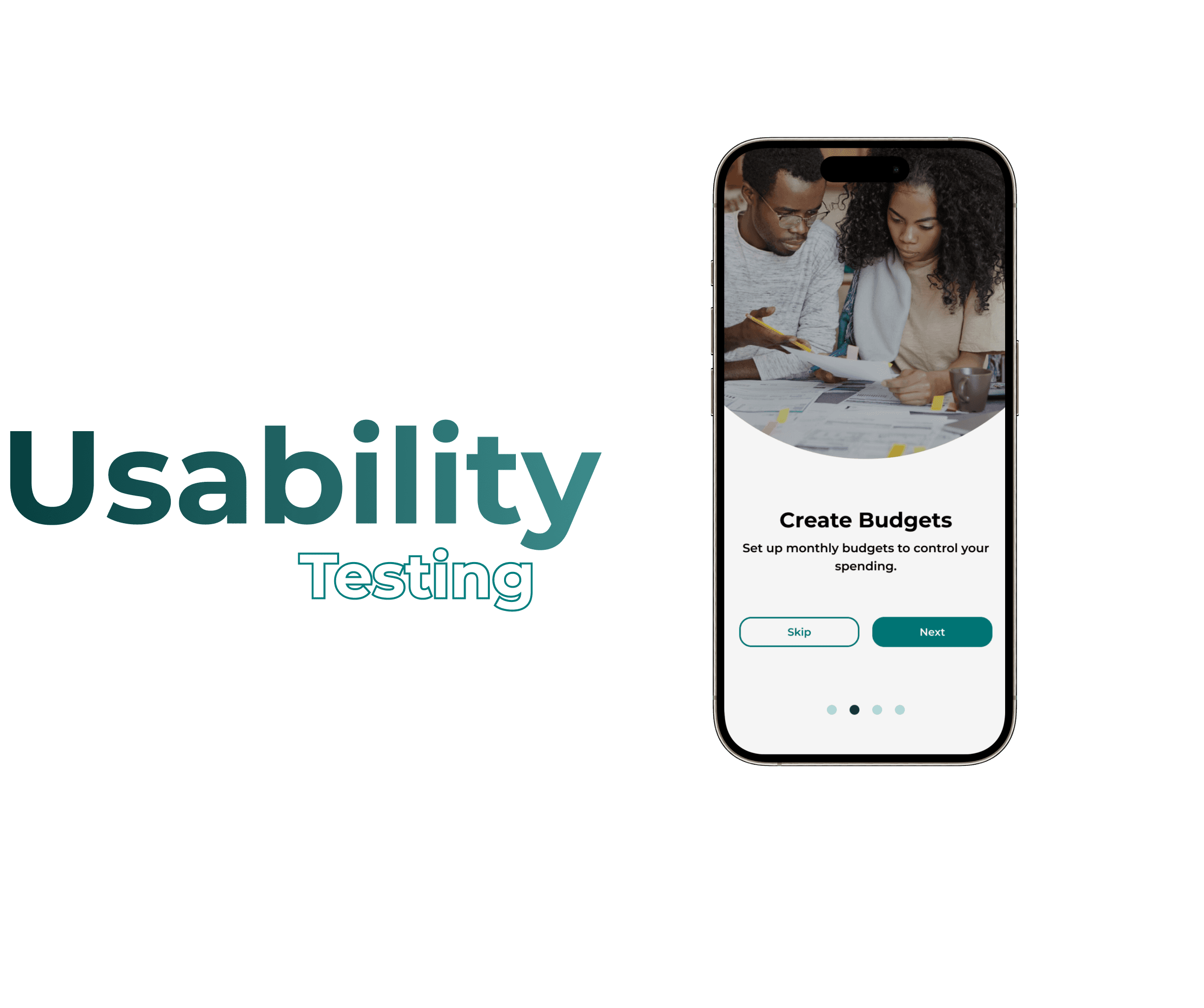
Study Overview
Objective: The objective of the usability study is to evaluate the usability and user experience of a personal financial application prototype. The study aims to identify any usability issues, gather feedback on user satisfaction, and validate design decisions to ensure the app meets user needs effectively.
Participants:
Participants will consist of a diverse group of 43 individuals representing the target user demographics, including age, gender, and level of tech-savviness.
Participants should have experience using a personal financial application but may vary in their familiarity with the specific features and functionalities offered by the prototype.
Methodology:
Pre-Study Questionnaire:
Participants will complete a pre-study questionnaire to gather demographic information, banking habits, and experience with mobile banking apps.Task-Based Testing:
a. Participants will be given a series of tasks to perform using the prototype, such as:
b. Logging into the app
c. Checking account balances
d. Transferring funds between accounts
e. Paying a bill
f.Viewing transaction history
g.Exploring additional features like currency conversion or stock trading.
h. Researchers will observe participants as they attempt to complete each task, noting any difficulties, errors, or points of confusion.Think-Aloud Protocol:
1. Participants will be encouraged to verbalize their thoughts and feelings as they interact with the app, providing insights into their decision-making process and user experience.Post-Task Questionnaire:
1. After completing each task, participants will fill out a brief questionnaire to rate their satisfaction with the task, ease of use, and any issues encountered.Data Analysis:
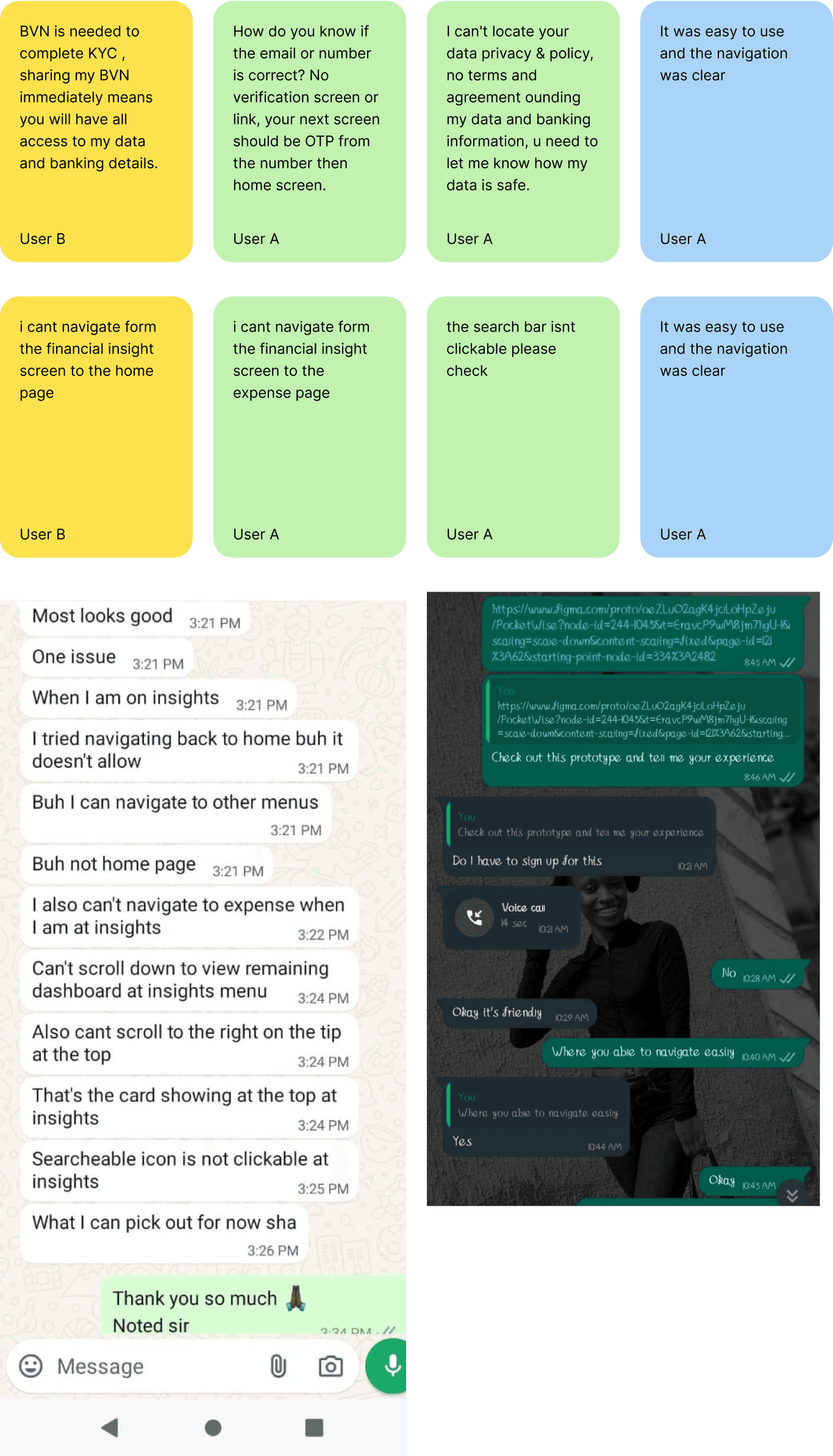
1. Researchers will analyze the data collected from observations, questionnaires, and interviews to identify common themes, usability issues, and areas for improvement.
2. Key findings will be documented, and recommendations will be made for refining the app's design and functionality.
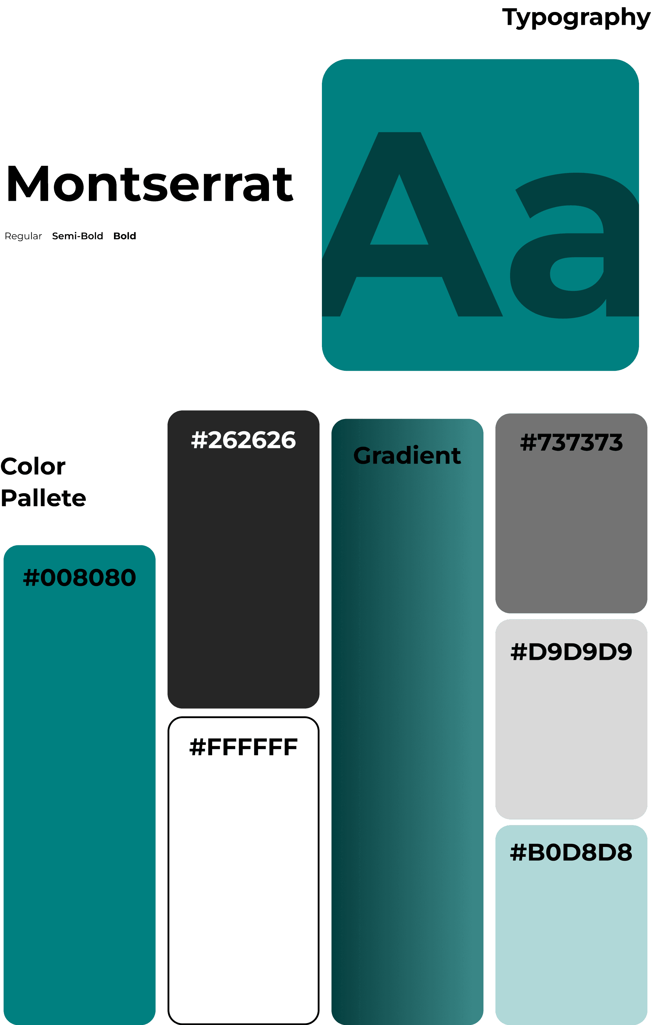
Design System
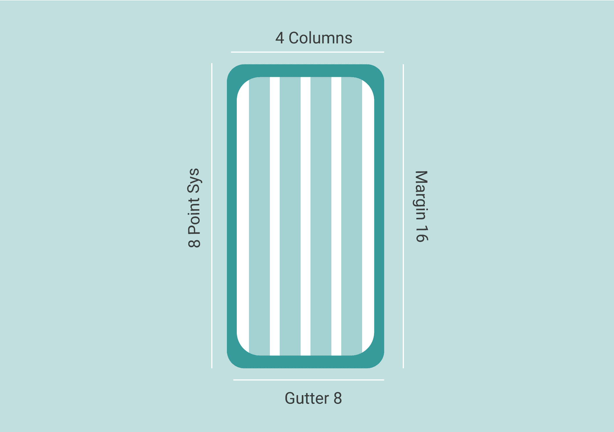
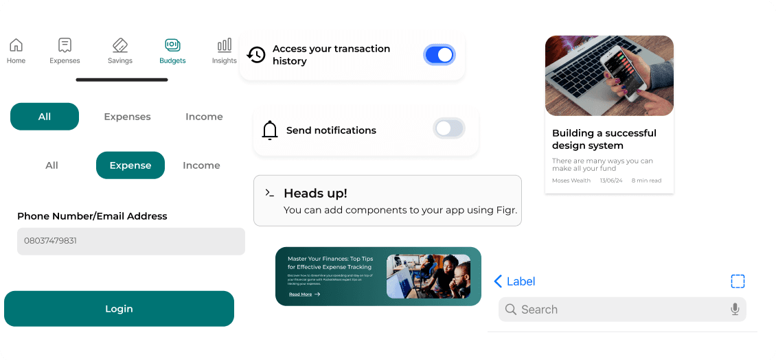
This system acts as a guide to establish clear hierachy with an aesthetic color palette aligning typography and graphical element to a grid.
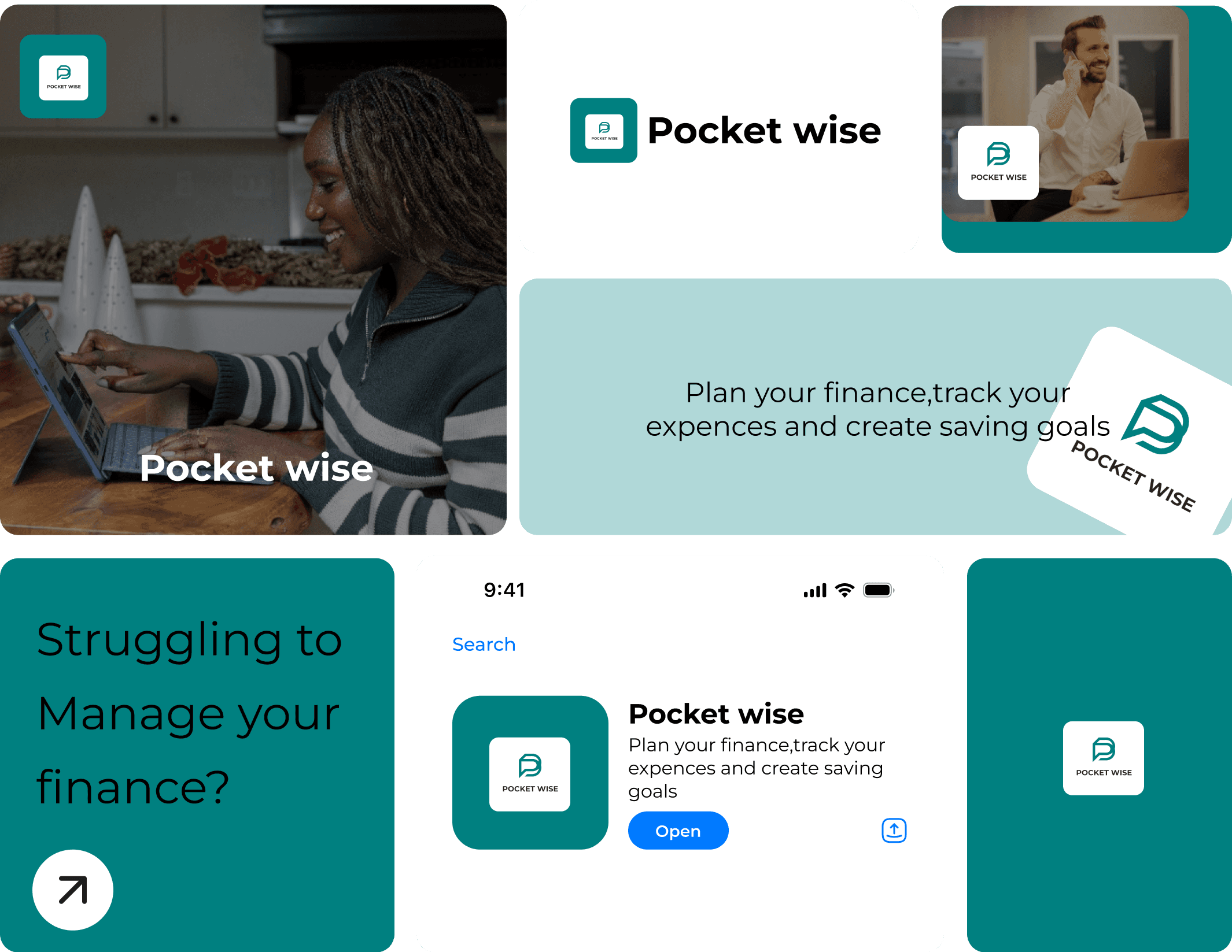
Branding
Grid system
Components
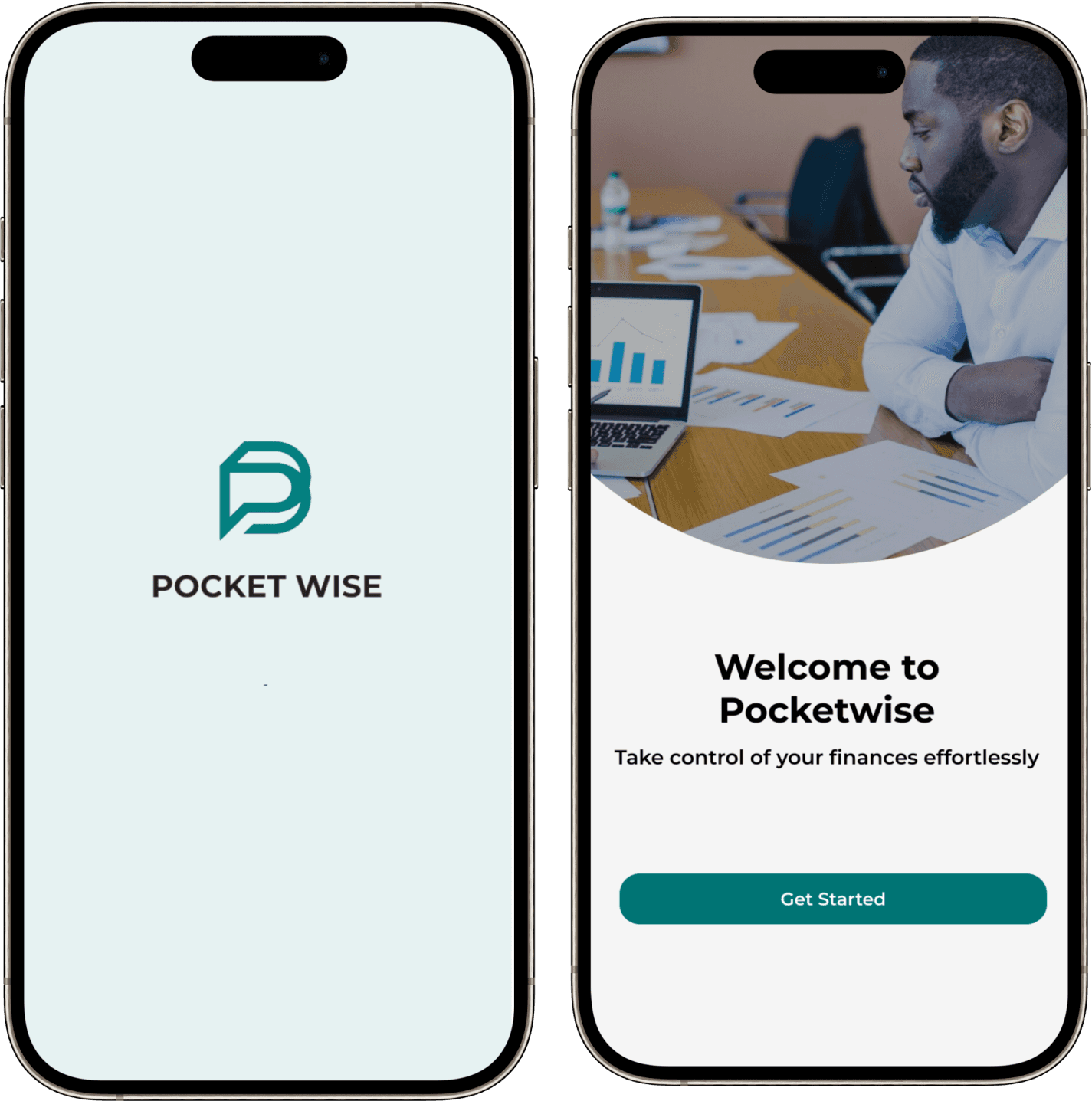
Splash Screens
The application starts with the splash screen to notify the users that the program is in the process of loading
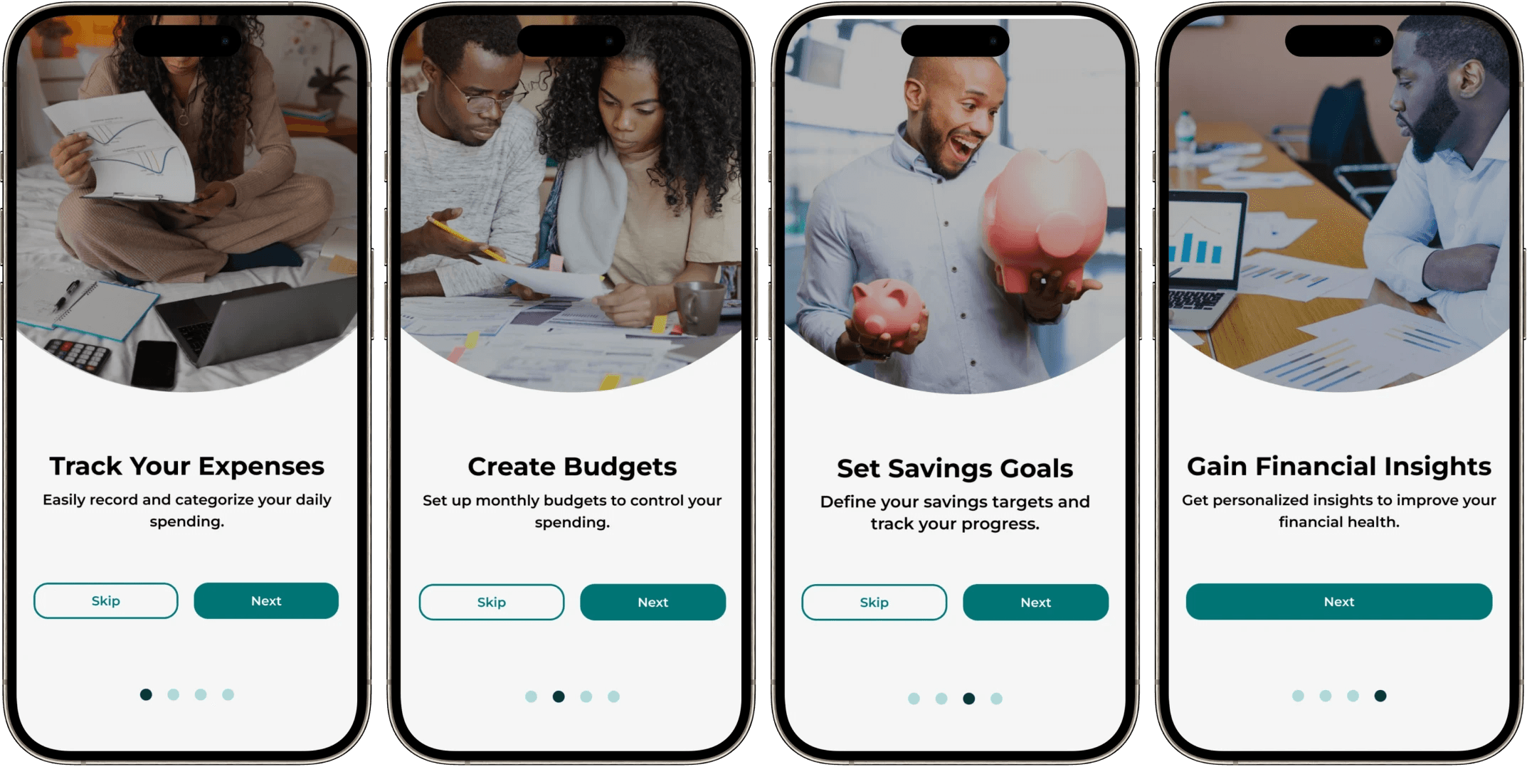
Quick Onboarding Screens
The onboarding screen gives you a thrilling idea of the features users would experience while using the app.
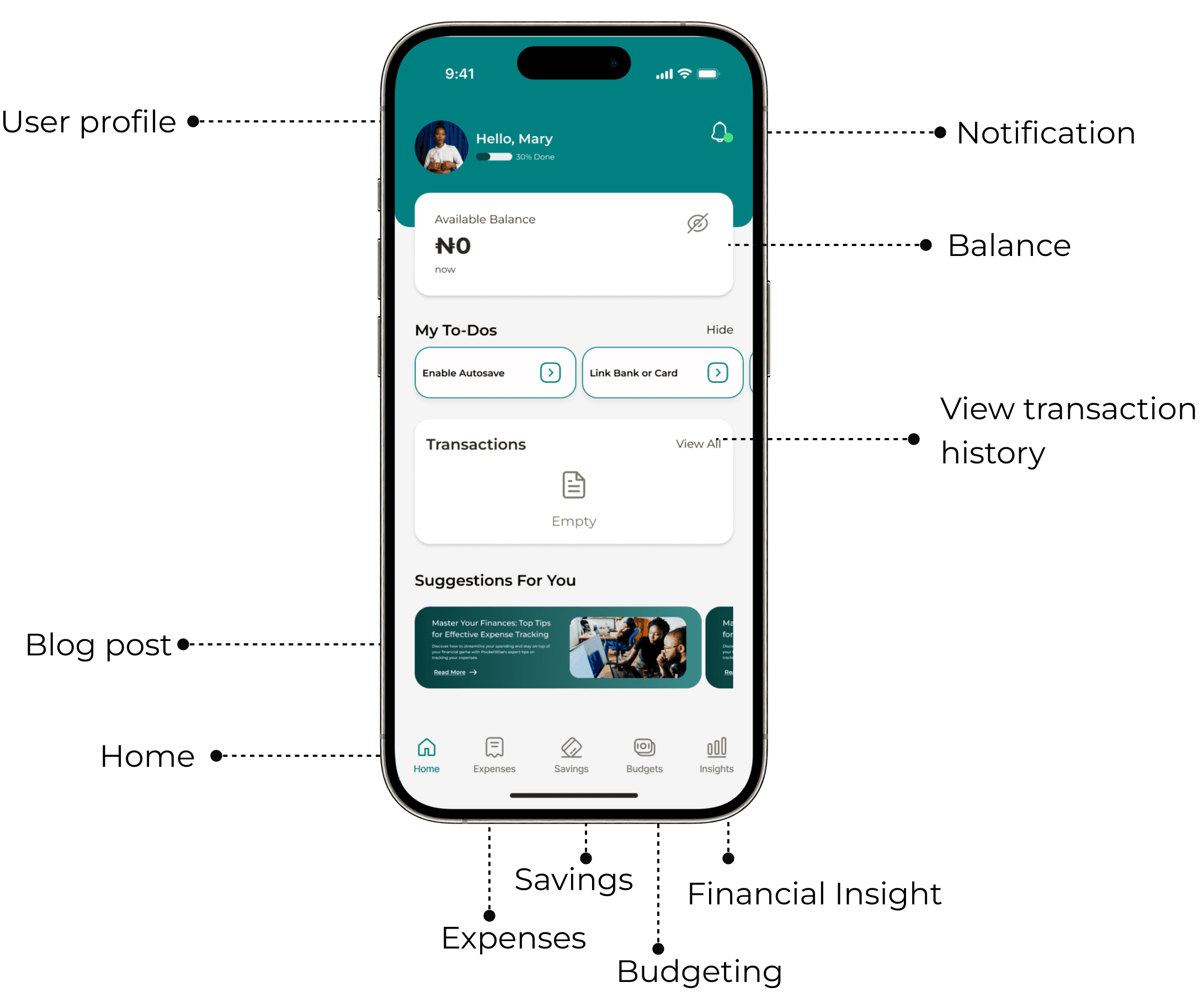
Homepage Screens
The homepage screen is designed with vital information and CTA buttons that help users to get the best out of the application effortlessly and easily.
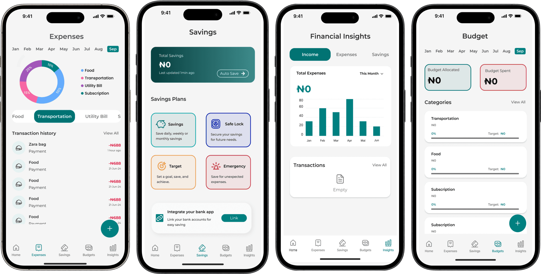
Major Screens
The major screens are designed with vital information and CTA buttons that help users to get the best of the application effortlessly and easily. They are the budgeting screen, expense screen, saving screen, and financial insight screen.
Prototype
Here is a link to the prototype:

